Background
Many older adults depend on others to get around. In rural areas where buses run rarely, or not at all, something as simple as visiting a friend or attending a medical appointment becomes a logistical challenge.
GoTogether was created to help bridge that gap. The app connects older riders (ages 70–85) with local drivers who have available seats, but for the service to truly work, the very first step needed to feel approachable: the sign-up process.
This project wasn’t just about designing a form. It was about designing comfort, clarity, and confidence for users who often feel left behind by digital tools.
Goal
Our goal was to create a sign-up flow that feels peaceful and predictable, especially for users with vision impairments or limited technological experience.
GoTogether needed to reduce cognitive load, minimize errors, and support older users with warm, accessible design choices, so that registering becomes not a hurdle, but a smooth starting point.
Process
We began by studying the unique challenges that come with aging: reduced contrast sensitivity, shaking hands, difficulty interpreting error messages, and unfamiliarity with modern UI patterns. These insights shaped our design from the beginning.
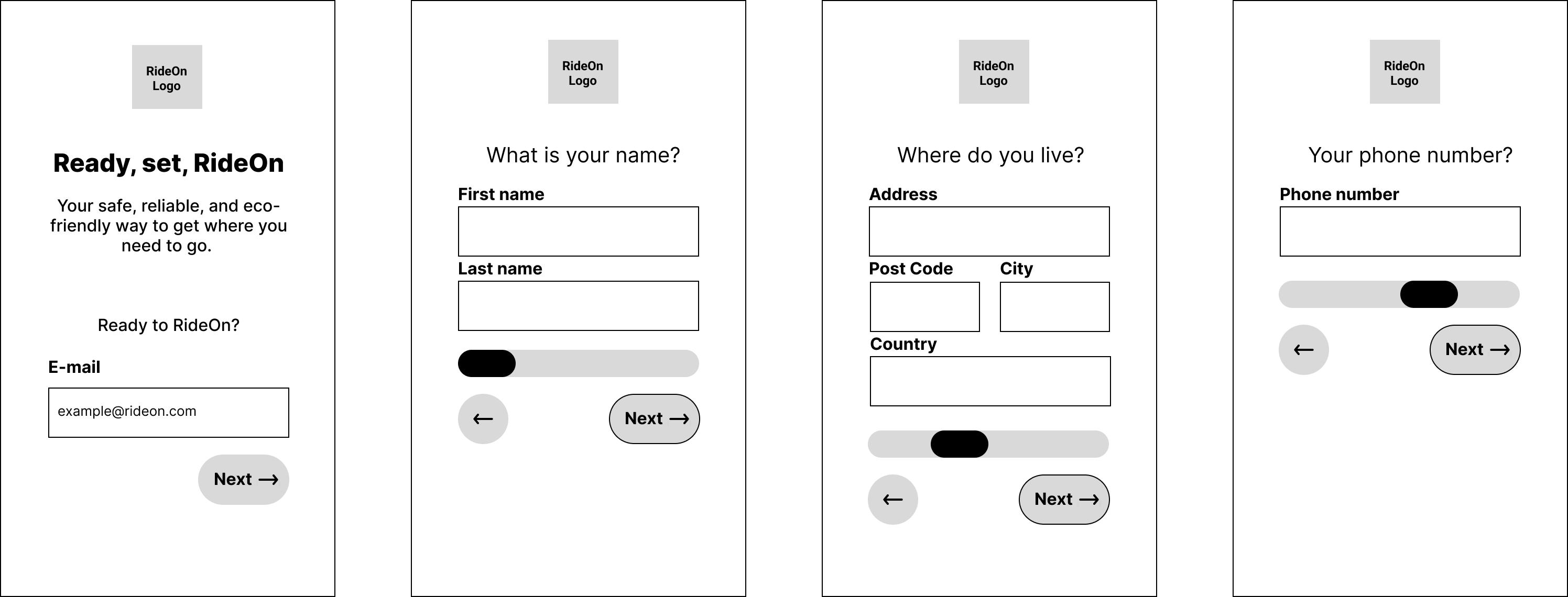
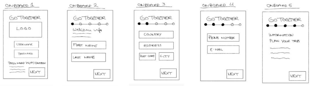
Early Ideation – RideOn
In the initial stages, we explored an alternative concept called RideOn, a low-fidelity prototype focused on testing tap targets, text sizes, and basic form layouts. RideOn served as a playground where we could test assumptions, identify usability barriers, and spot early accessibility pitfalls.
This exploration helped solidify what our final product truly needed to be: calmer, clearer, more linear, more intuitive.
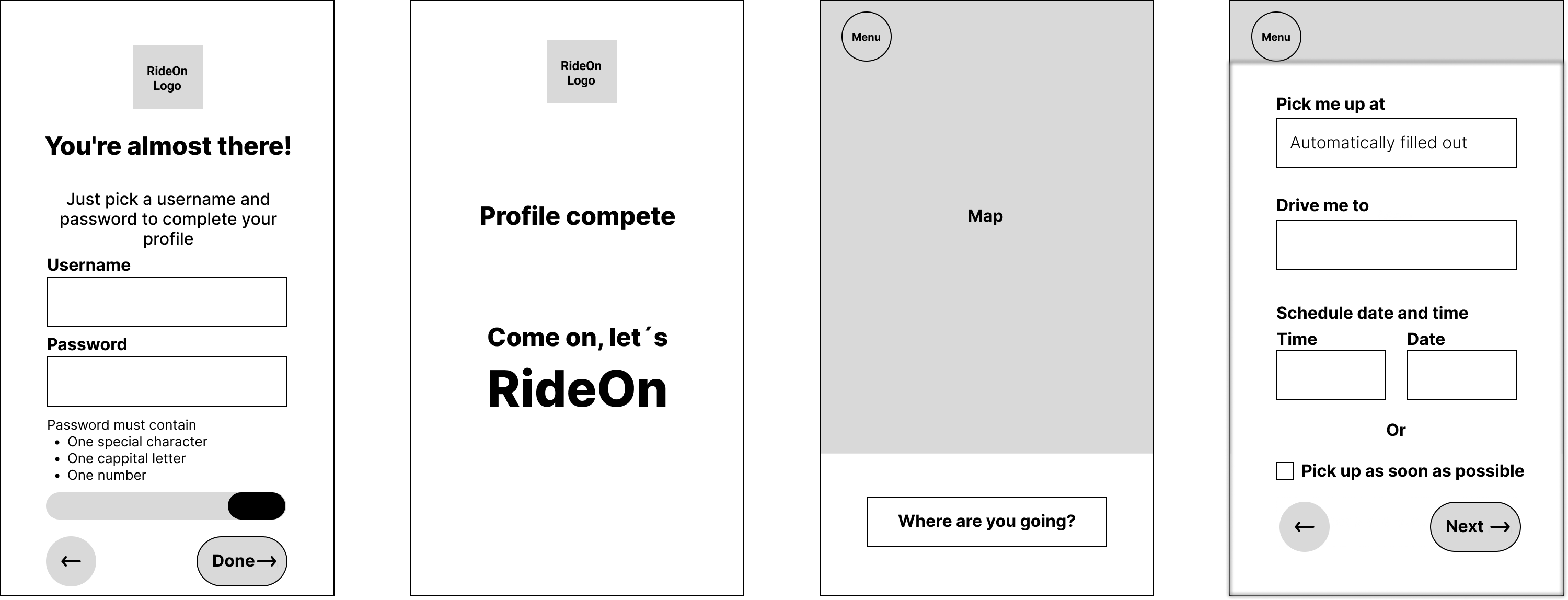
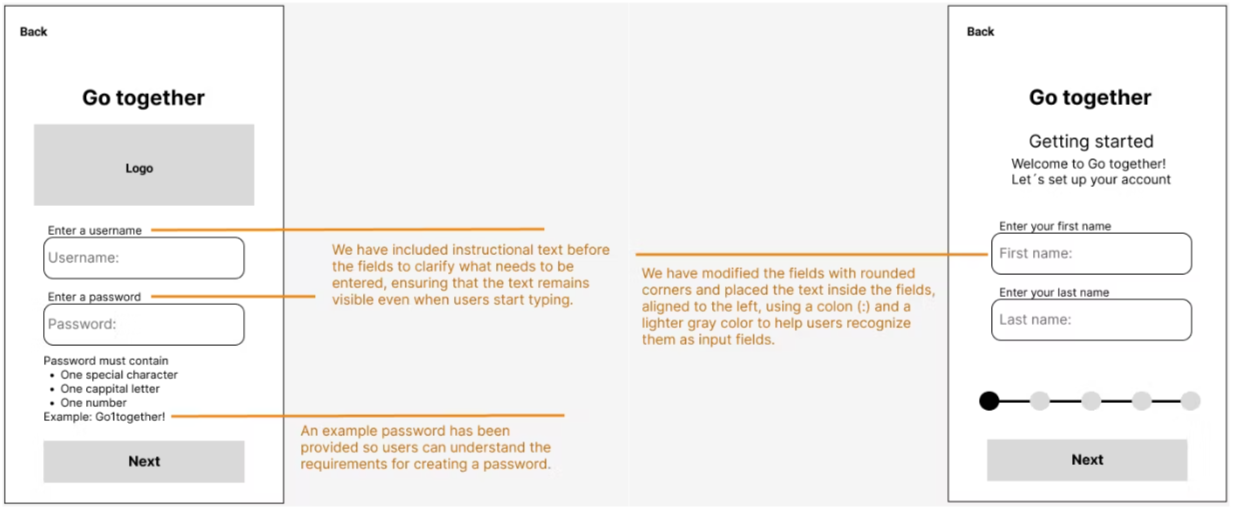
We conducted usability testing with an older participant. Her feedback illuminated subtle but important issues: input fields were not immediately recognizable, and password requirements needed clearer examples. These insights became catalysts for refinement.
Iterating Toward Clarity
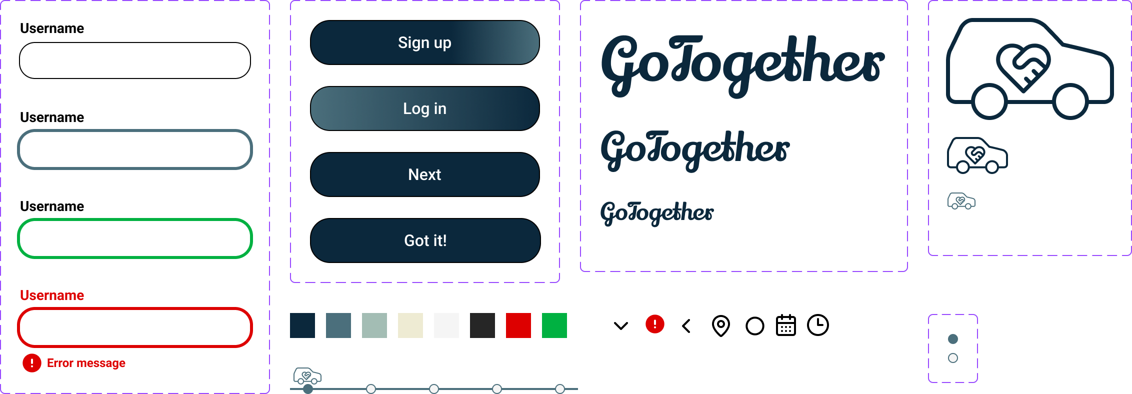
We updated the input fields with stronger outlines, larger touch areas, and more recognizable shapes. We added help text above each field and introduced a password example to reduce confusion and anxiety.
Little by little, GoTogether became simpler, kinder — and far easier to complete without hesitation.
Result
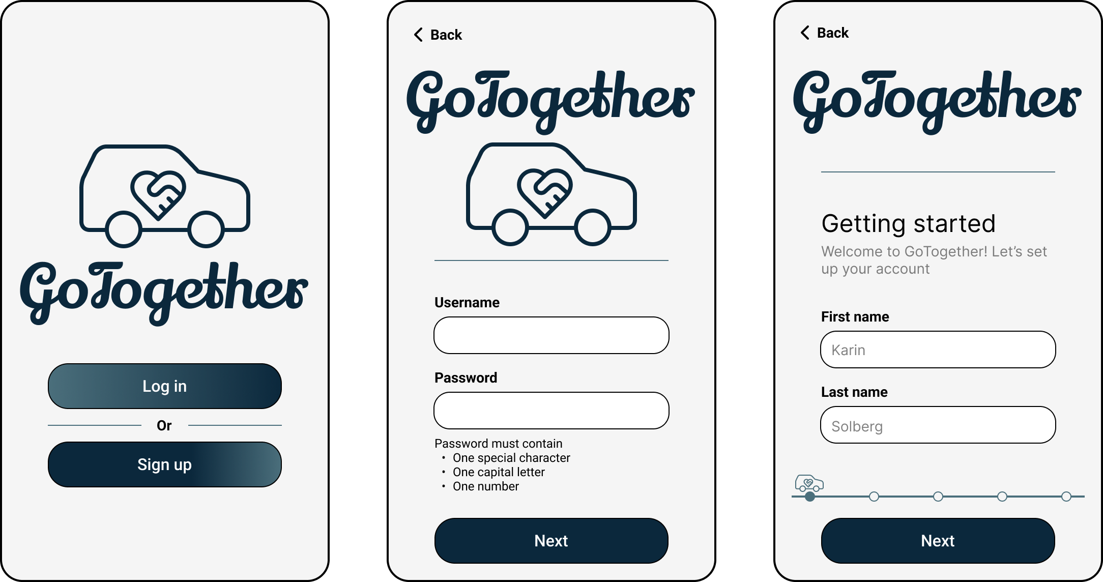
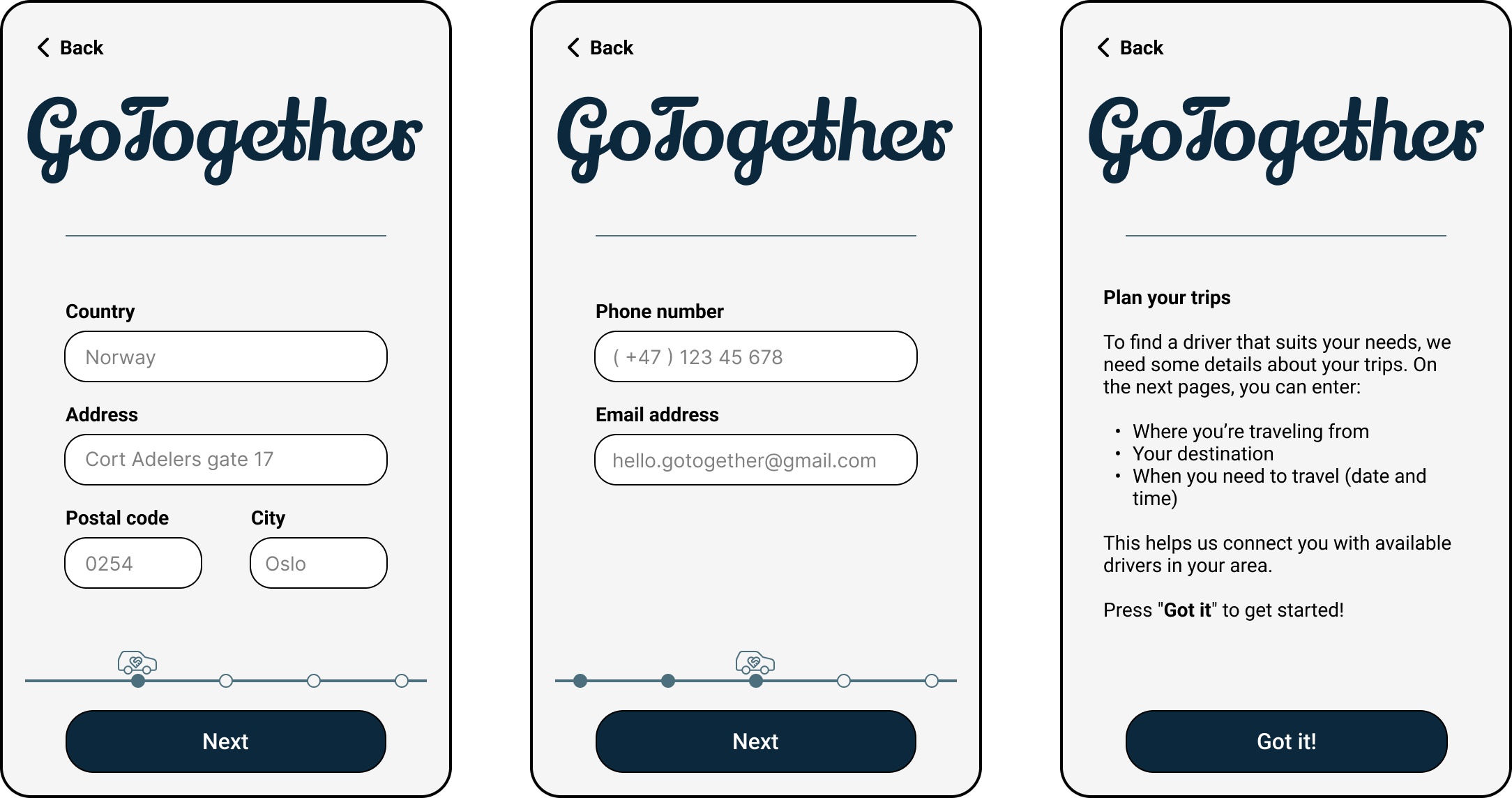
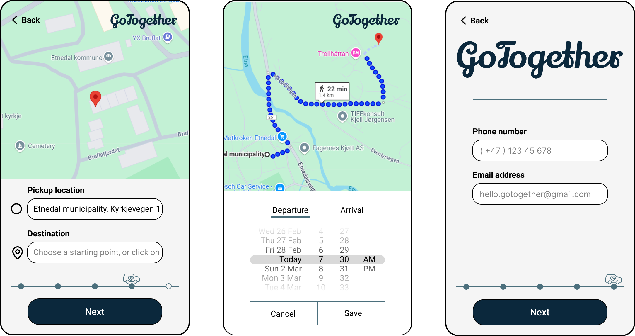
The final GoTogether sign-up flow is a calm, accessible, and highly readable experience designed for an older audience. It includes:
- large, spacious type and tap areas
- high-contrast visual design
- friendly and precise error messages
- a linear, step-by-step structure
- clear guidance at every point
- and thoughtful accessibility decisions grounded in user testing
GoTogether doesn’t overwhelm the user with choices or complexity. Instead, it guides them gently, one screen, one action, one success at a time.