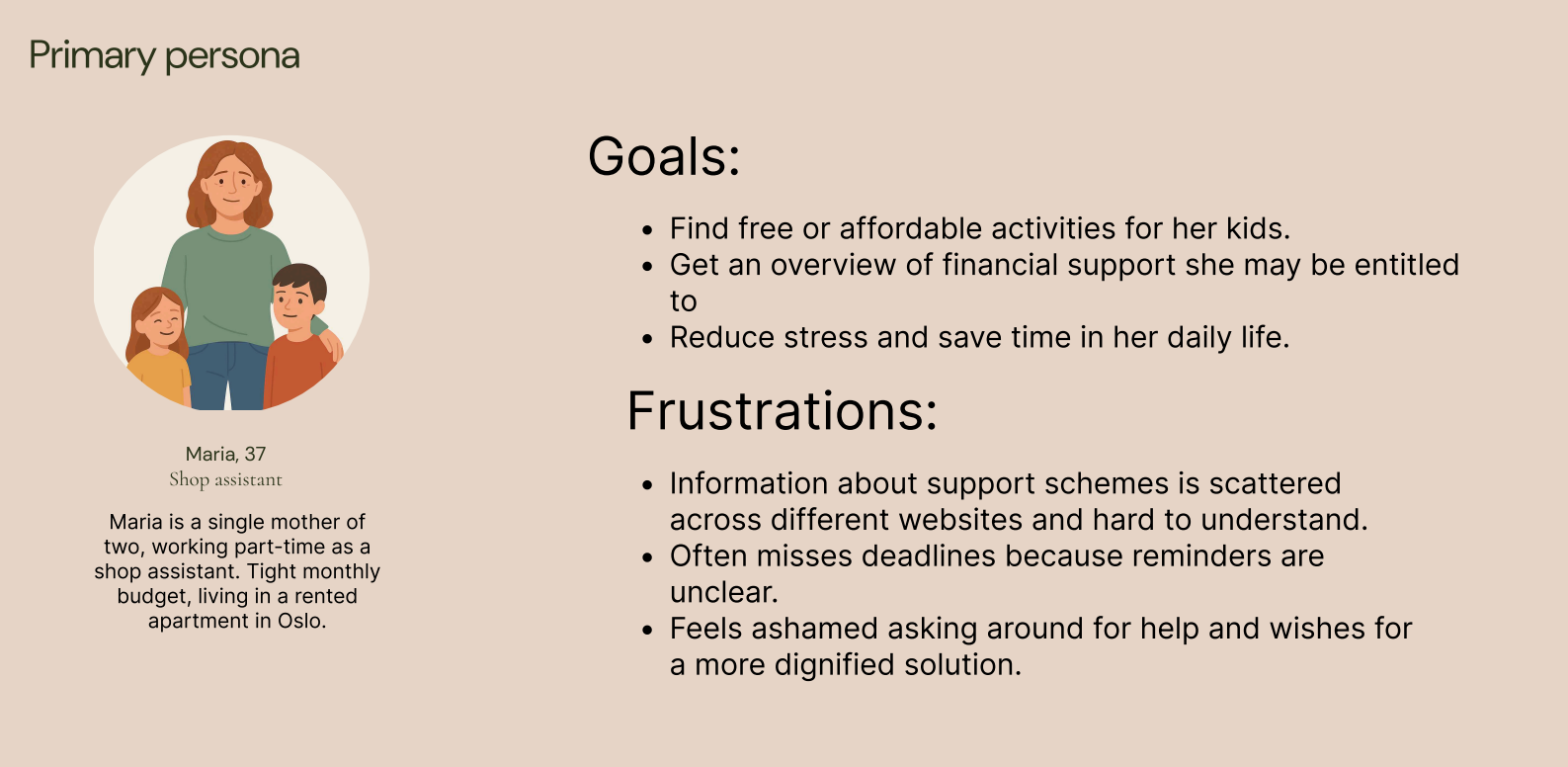
Background
Economic vulnerability is not only about lack of money, it’s often about lack of overview and access. Today, support information is scattered across different websites, posters, and social media, often hidden behind complex language and bureaucracy. This fragmentation leads to:
- missed deadlines
- wasted time
- increased stress
- people not getting help they are entitled to
Our insight was clear: when life is already difficult, help should be easy. Hverdagshelten was created to restore dignity through simplicity.
Goal
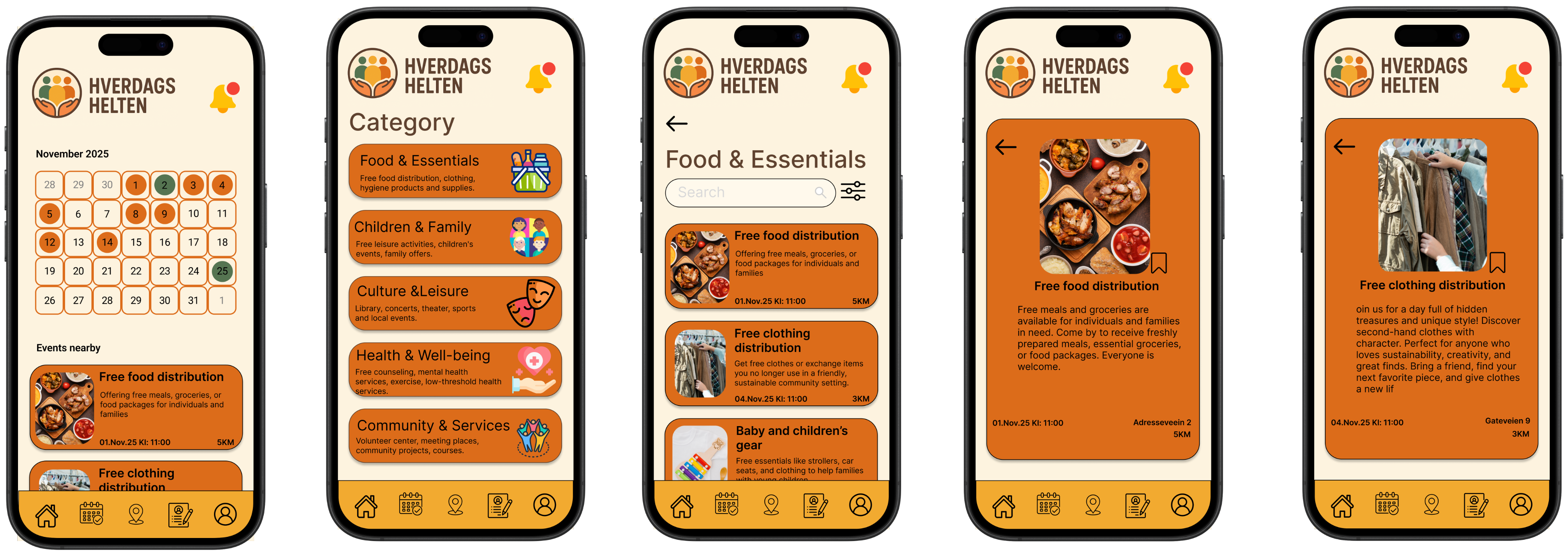
Our goal was to design a centralized, user-friendly app where people can:
- find free community resources such as food distribution, children’s activities, and cultural events
- receive guidance on support schemes with clear steps
- get reminders before important deadlines
We focused on ensuring:
- accessibility
- simplicity
- and a sense of control in everyday life
Process
We followed a human-centered UX approach grounded in empathy and inclusion.
We conducted:
- Literature review to understand the emotional and systemic challenges tied to economic vulnerability
- Competitor analysis (NAV, municipalities, Facebook groups) to identify gaps like complex language and unclear navigation
- User survey confirming the need for reminders, guidance, and better navigation of free offers
This resulted in key insights: People want help, but the system is too hard to navigate.
My Contribution in Design
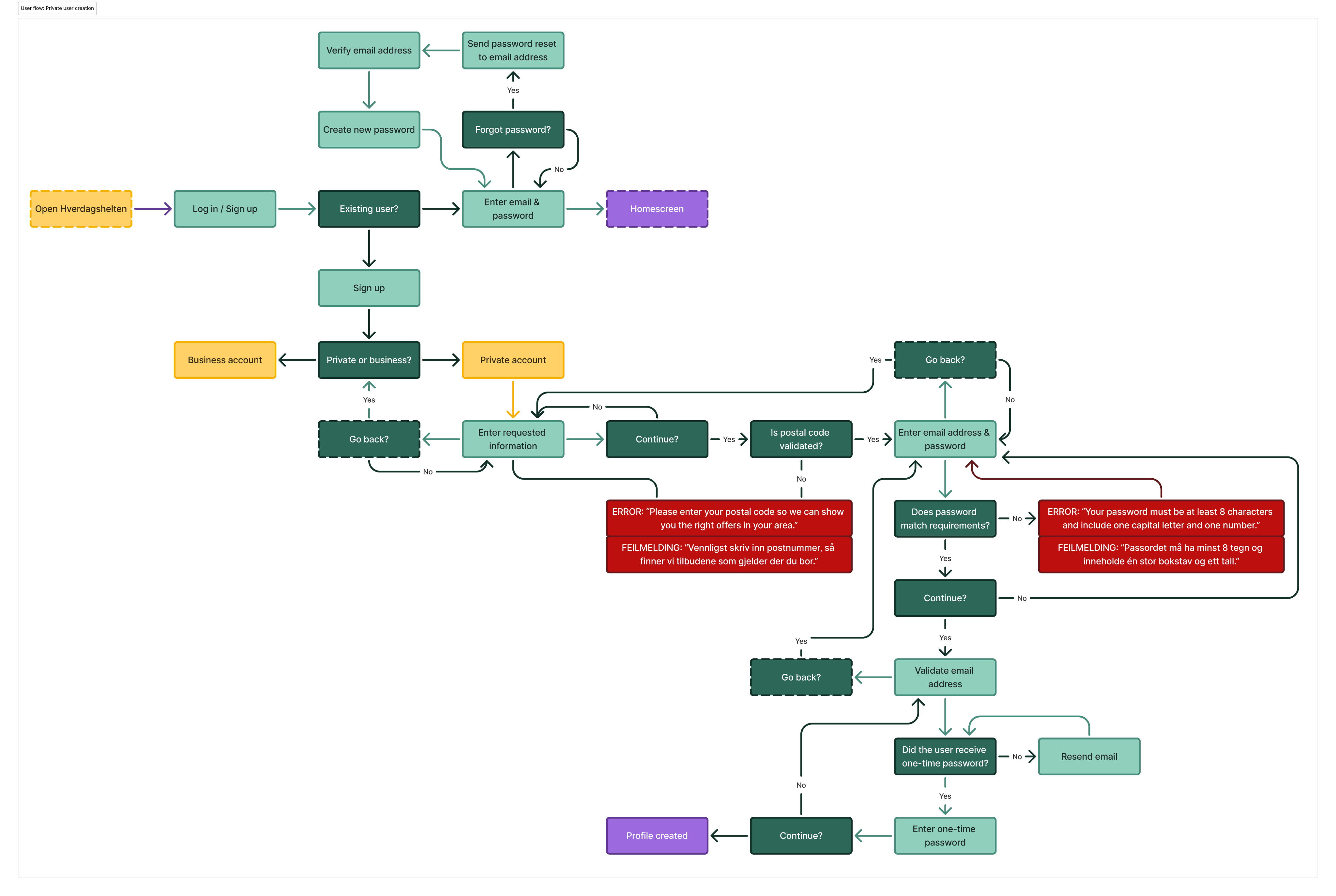
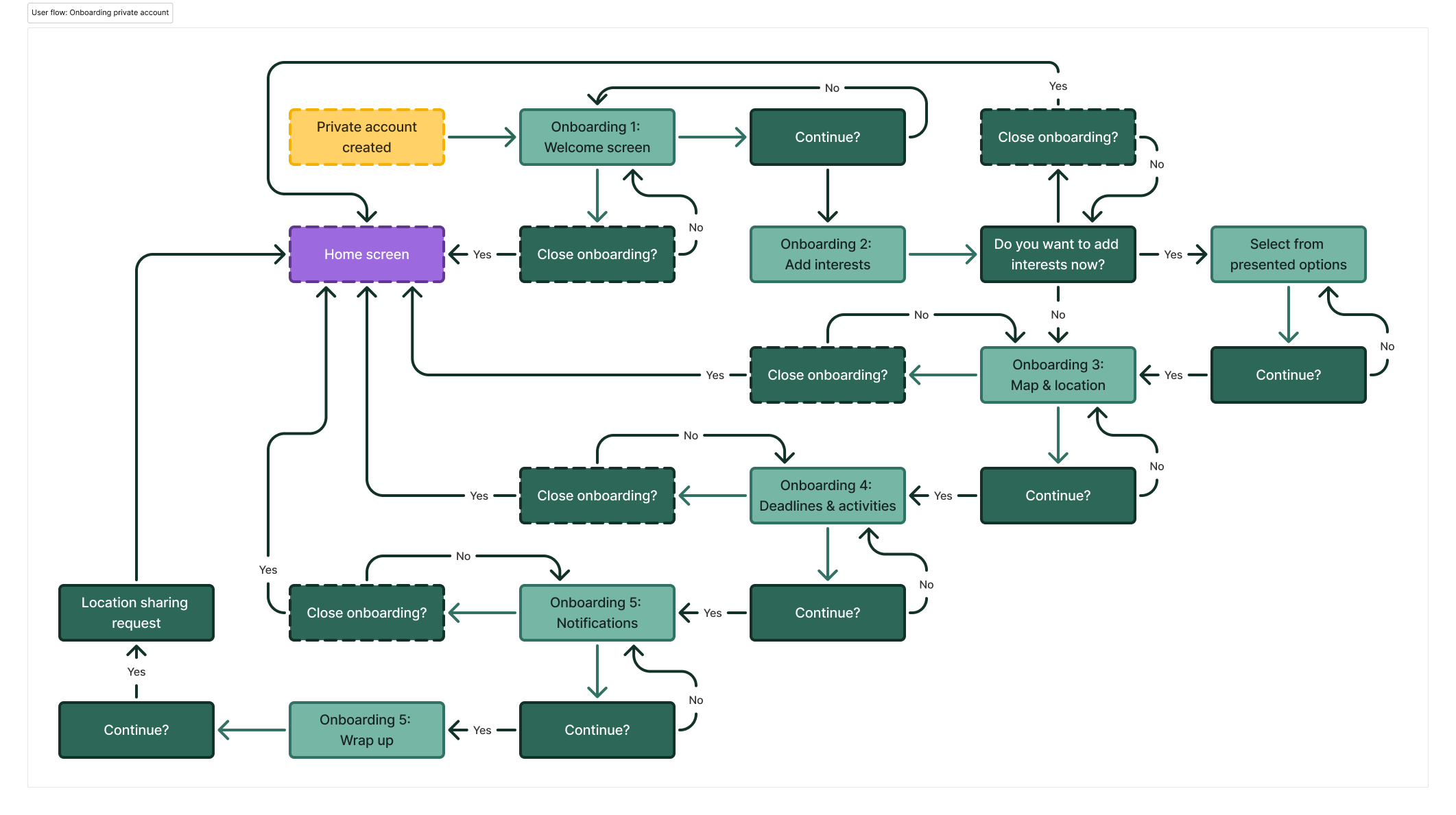
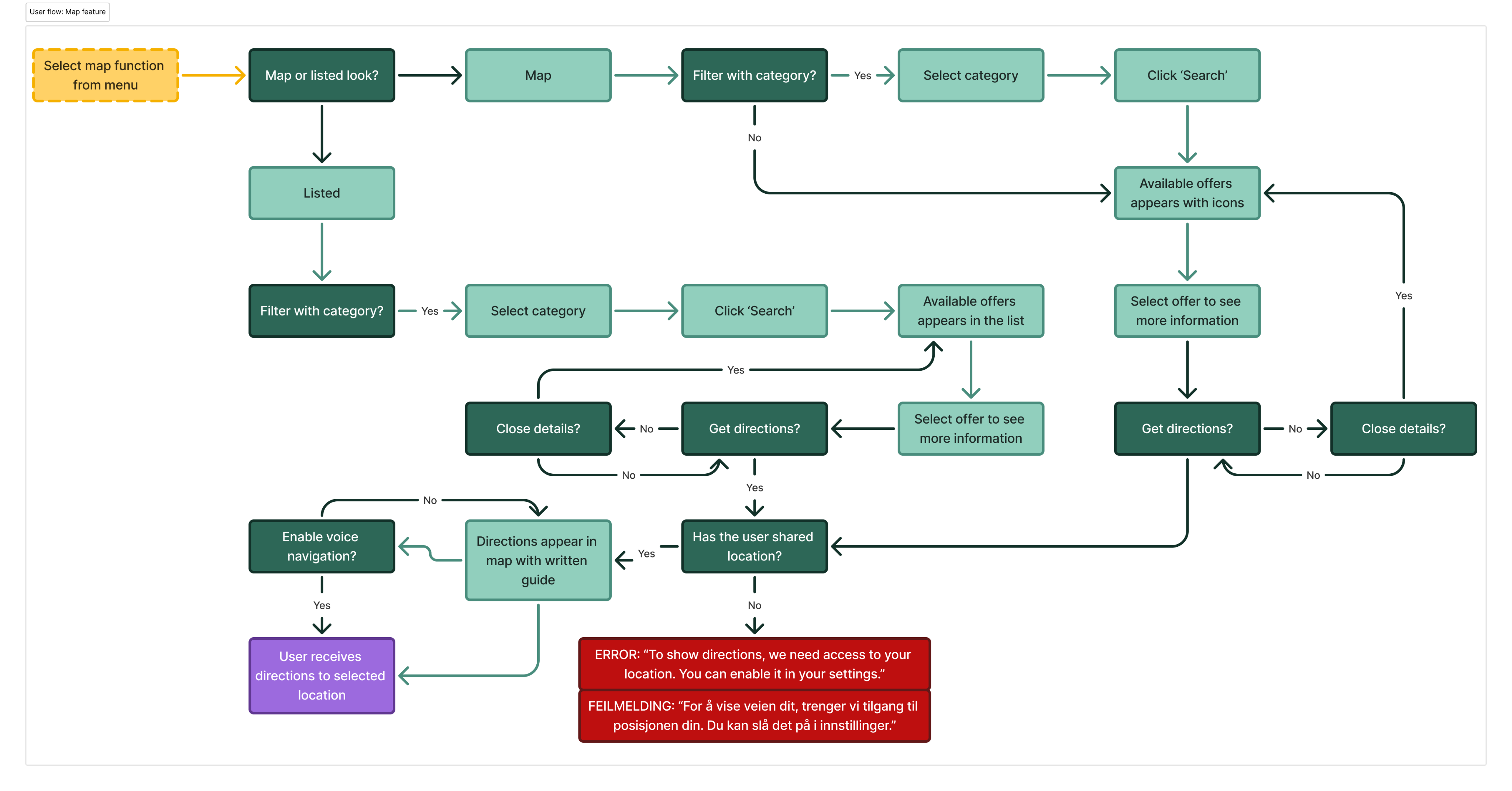
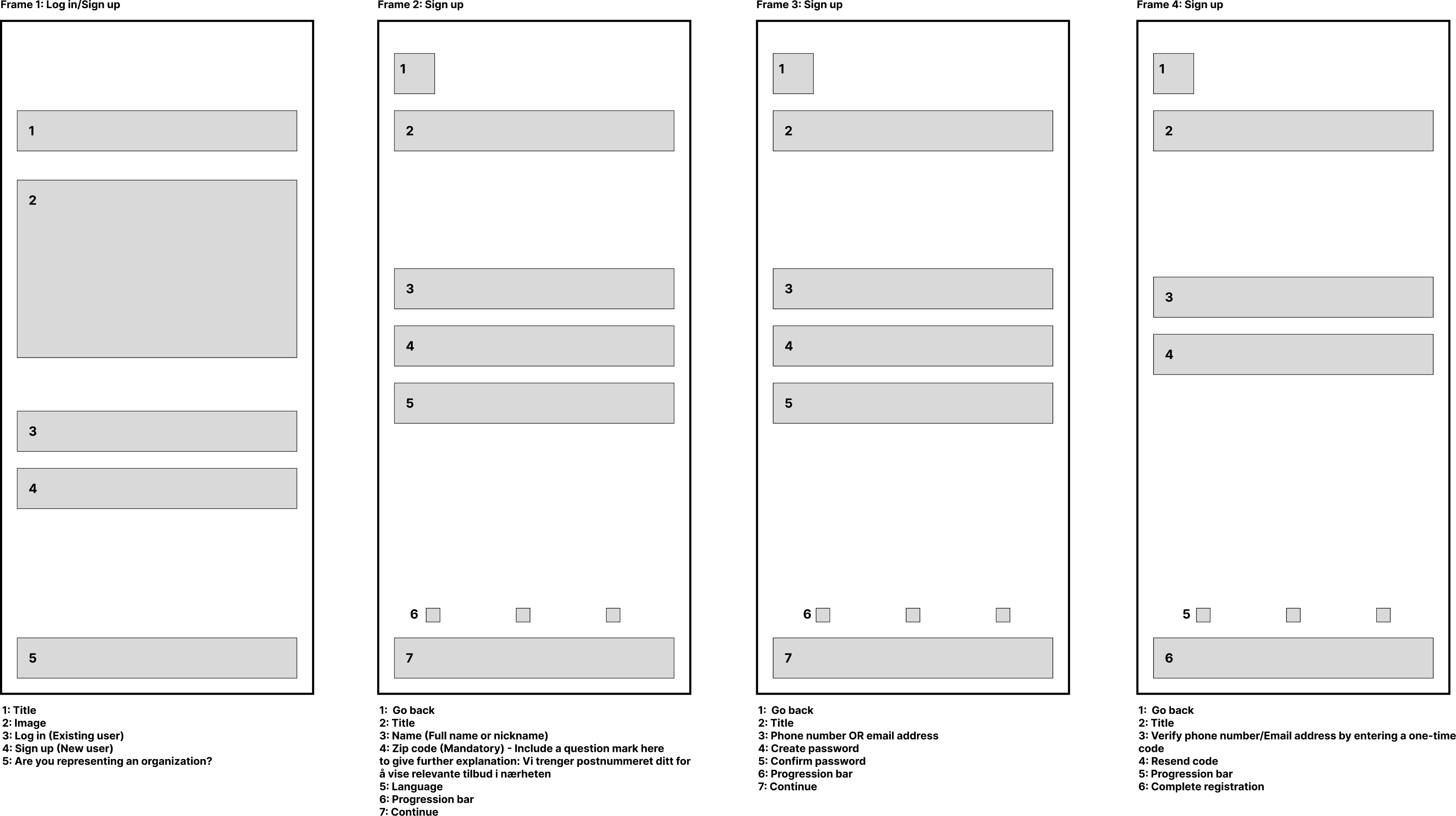
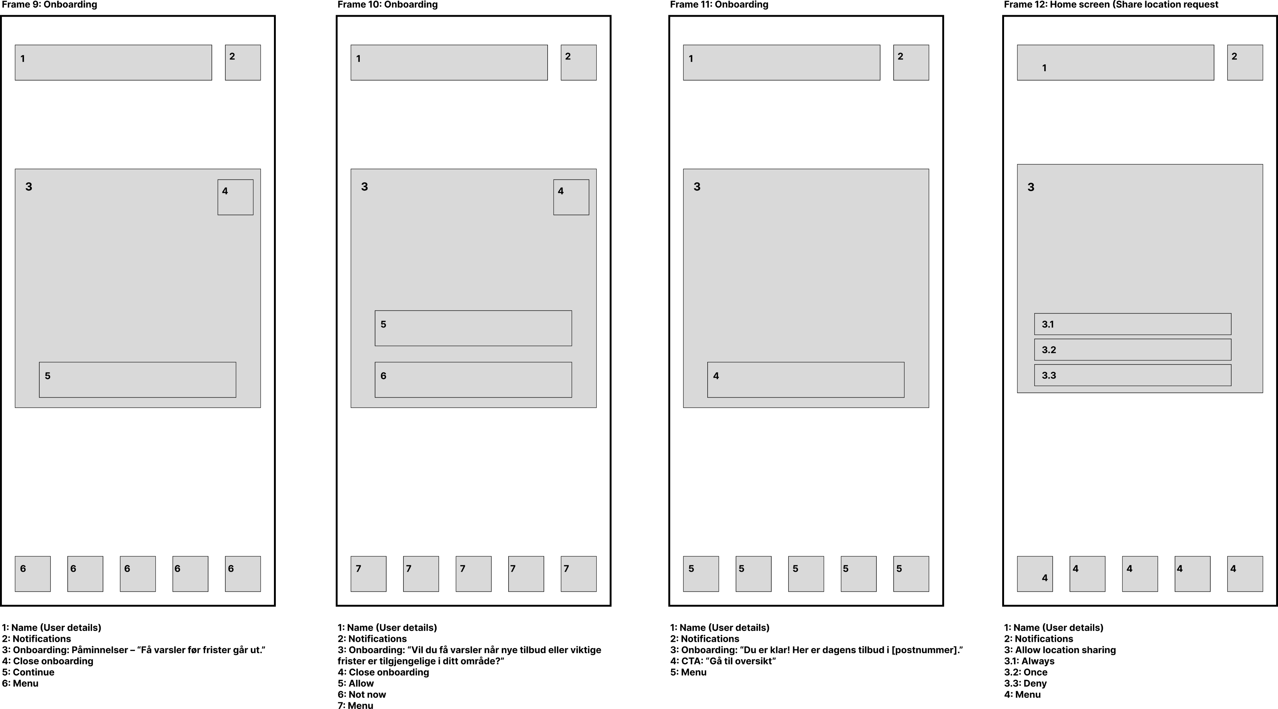
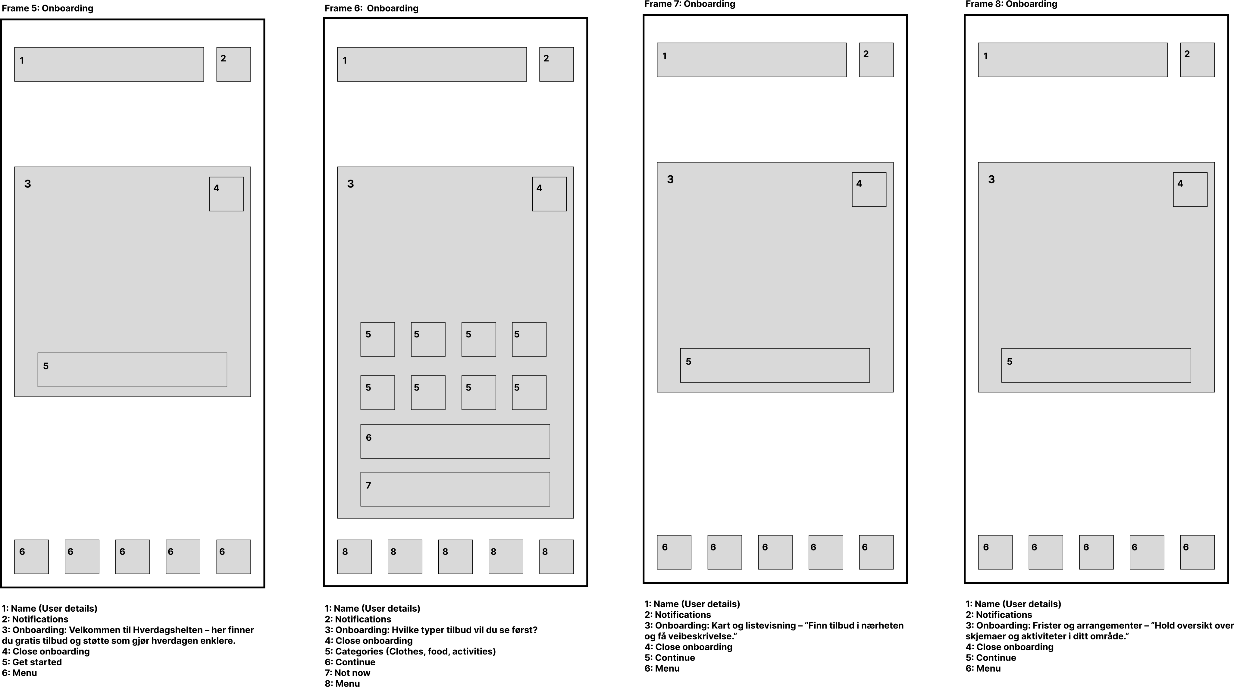
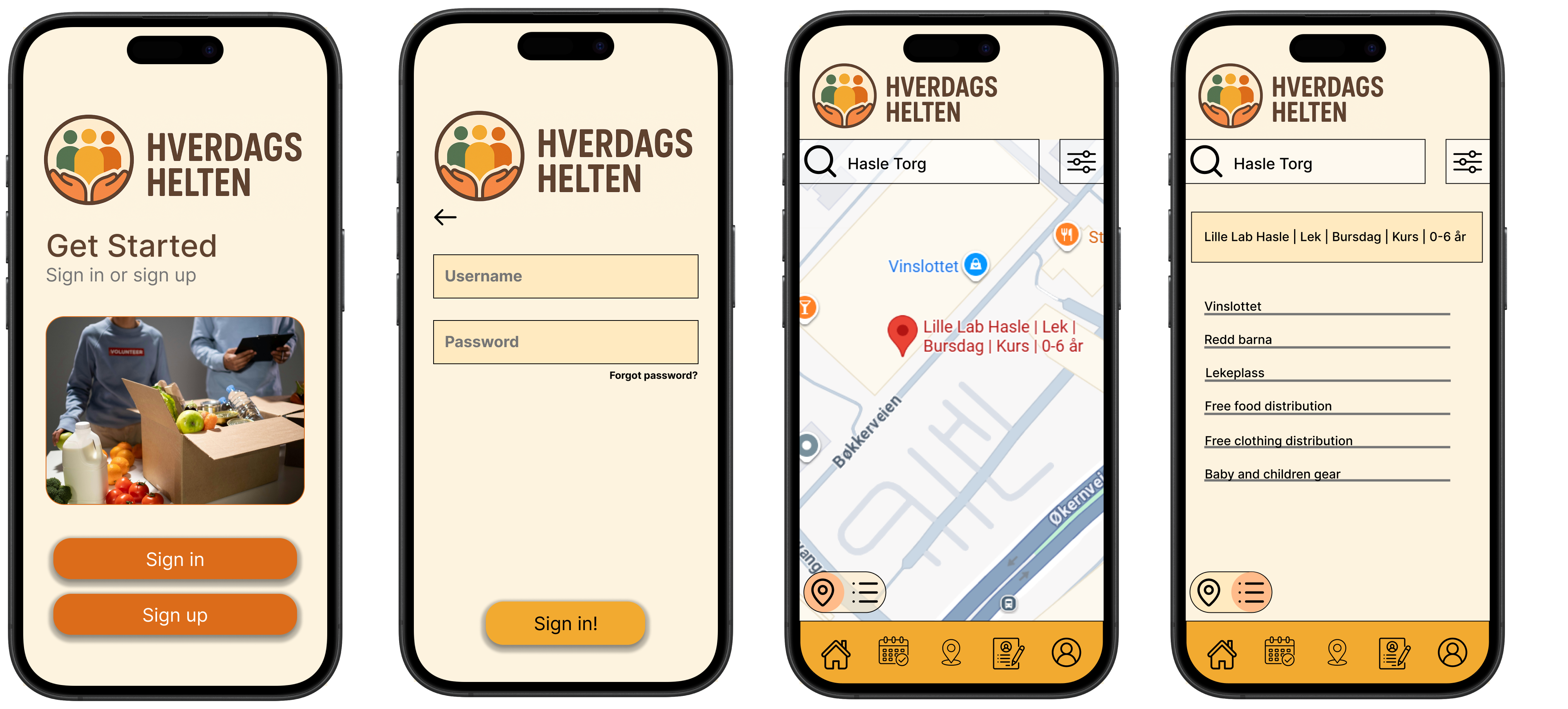
I contributed heavily to the private user experience, including:
- User flows for exploring offers and navigating the app
- Map feature to find and get directions to help nearby
- Login, onboarding steps, and personalization (sharing location, category preferences, notifications)
- Profile-related wireframes, connecting saved events and applications back to the user
I focused strongly on:
- clear user guidance
- flexibility in navigation
- minimizing cognitive load